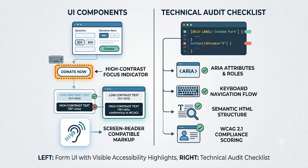
Charity websites reach a wider range of visitors than most commercial sites – older donors, people with visual or motor impairments, and users on assistive technology are a meaningful share of charity web traffic. An inaccessible donation page doesn’t just risk falling short of the Equality Act’s expectations around reasonable adjustments – it directly loses donations from people who simply can’t complete the form.
Here’s a practical checklist based on WCAG 2.2 AA, the standard most commonly referenced for UK charity and public-facing websites.
1. Colour and Contrast
- Body text should have a contrast ratio of at least 4.5:1 against its background
- Large text (18pt+ or bold 14pt+) needs at least 3:1
- Never rely on colour alone to convey meaning – e.g. a red border on an invalid field also needs an icon or text label, since colour-blind users may not perceive red vs green distinctions
This trips up charity sites more than most, since brand colours (often deep, saturated tones) are sometimes used for body text or button labels without checking contrast against their background.
2. Keyboard Navigation
- Every interactive element – donation amount buttons, Gift Aid checkbox, submit button – must be reachable and operable using only a keyboard (Tab, Shift+Tab, Enter, Space)
- Focus states need to be visible – a user tabbing through the form should always be able to see where they are
- Custom-styled buttons and dropdowns (a common feature of donation amount selectors) are the most frequent offenders here, since custom JS components often forget to preserve native keyboard behaviour
3. Screen Reader Compatibility
- Form fields need properly associated
<label>elements, not just placeholder text (placeholder text disappears once a user starts typing and isn’t reliably read by all screen readers) - Error messages should be announced, not just shown visually – use
aria-liveregions so a screen reader user knows their donation didn’t go through and why - Icon-only buttons (a lot of donation forms use icon buttons for amount increments or gift toggles) need an
aria-labeldescribing their function
4. Form Structure and Error Handling
- Group related fields (like the Gift Aid declaration block) using
<fieldset>and<legend>so their relationship is clear to assistive technology - Validation errors should be specific (“Enter a valid postcode,” not just “Error”) and appear near the field they relate to
- Never rely solely on a red asterisk to indicate a required field – pair it with the word “required” in the label
5. Text and Readability
- Avoid justified text alignment (it creates uneven spacing that’s harder to read for people with dyslexia)
- Keep line length reasonable – very wide text blocks are harder to track visually
- Ensure text can be resized up to 200% without breaking the layout or cutting off content
6. Time Limits and Motion
- If your donation session has a timeout (common with payment gateways), give users a way to extend it before it expires
- Avoid auto-playing video or animation on donation pages, or provide a clear way to pause it – motion can be genuinely disorienting for some users, not just a preference
Why This Matters Beyond Compliance
Charities are increasingly expected to meet accessibility standards under the Equality Act 2010’s “reasonable adjustments” duty, and public-sector-adjacent charities may fall under the Public Sector Bodies Accessibility Regulations directly. But beyond the legal context, the practical case is simpler: every accessibility fix on a donation form tends to improve completion rates for all users, not just those relying on assistive technology. Clear labels, visible focus states, and specific error messages reduce confusion and abandonment across the board.
Quick Self-Check
If you want a fast read on where your current donation page stands, run it through the free WAVE accessibility checker or Chrome’s built-in Lighthouse accessibility audit. Neither replaces a full manual and screen-reader test, but both will surface the most common issues quickly.